From 1 to 1 Billion

The world’s leading social networking site, Facebook, has historically grown from 1 to 1 billion users in a matter of eight years.  In late September of 2012, CEO Mark Zuckerberg posted a status update stating the site has reached 1 billion users.  This exponential growth comes from a wide array of reasons such as user friendliness, easy accessibility, communication capabilities, and how current the site is to it’s time.

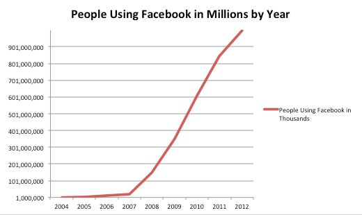
The graph above shows that the site started from 1 million users at the end of 2004, to a record breaking 1.01 billion users by September 2012.

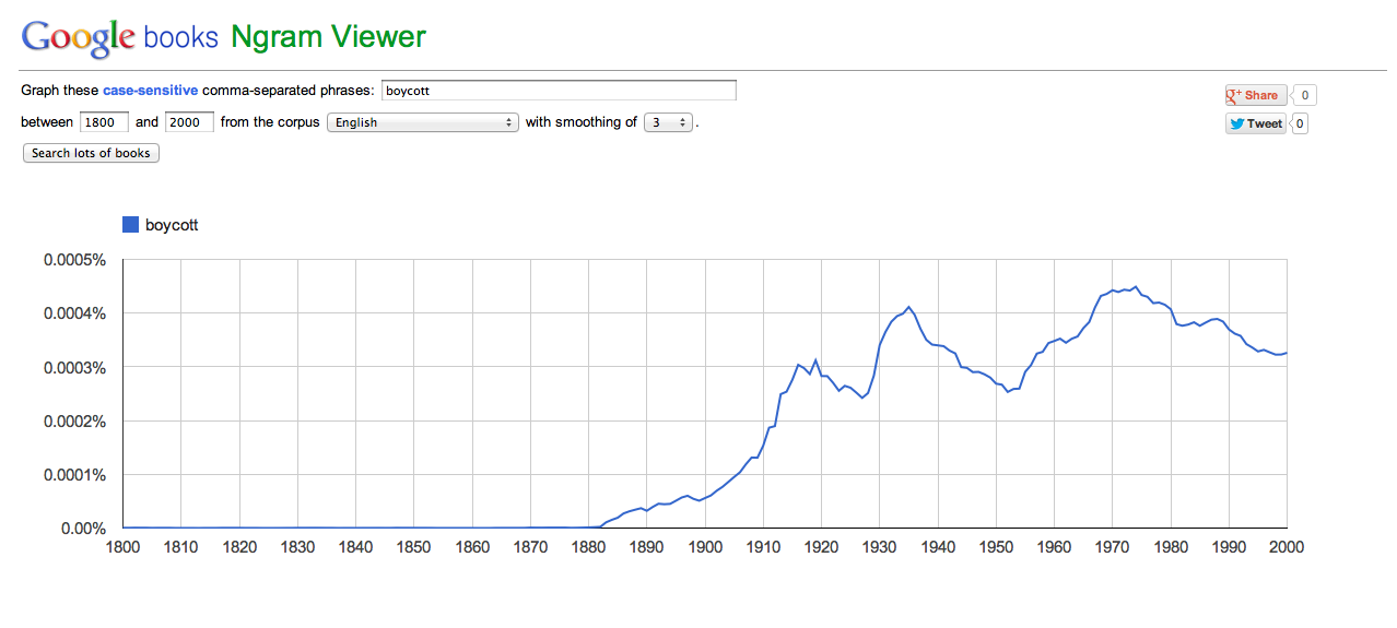
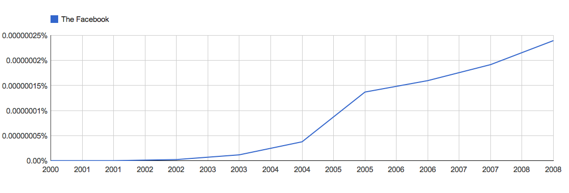
The popularity of the site has been ever increasing since it’s launch in 2004.  The site is mentioned frequently in the news, on the web, in articles, books, etc.  When creating a Google books Ngram, it is evident that “Facebook” becomes more and more apparent in books as time continues to progress.  The graph is a representation of the words “The Facebook” because in it’s former years, that is how it was titled.  Check out the Ngram below:

One of the many reasons why Facebook is so popular amongst the masses is because it is easily accessible across all corners of the world.  There are currently 212 countries using the site worldwide.  Facebook is also free.  If Facebook wasn’t free, it wouldn’t nearly have the amount of success it has today.  Fishermen in third world countries with little or no social status or wealth, are able to hold Facebook accounts through access to the web.  Because Facebook is such a global community, it has several offices spread across the world. Below is a map showing the many cities where Facebook has stepped foot in.


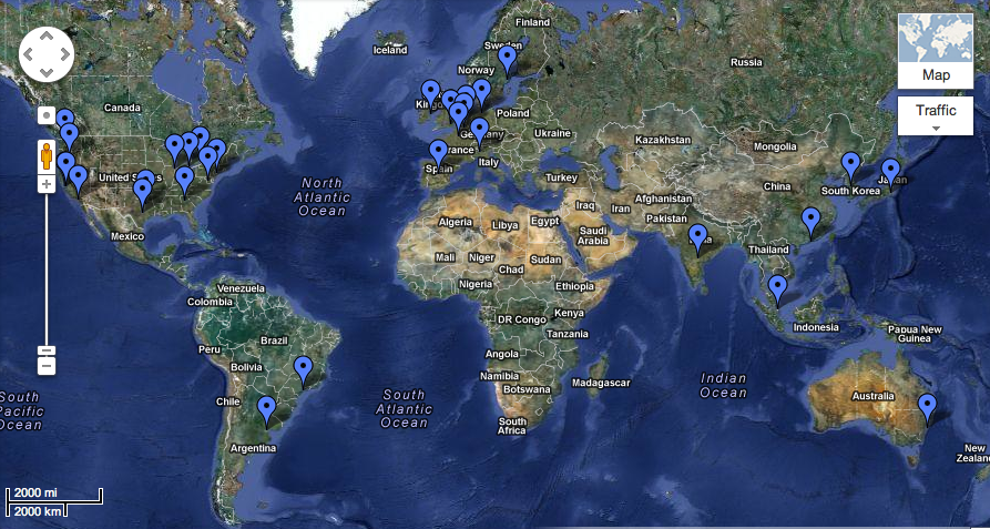
View Locations of Facebook Offices Around the World in a larger and more interactive map here.

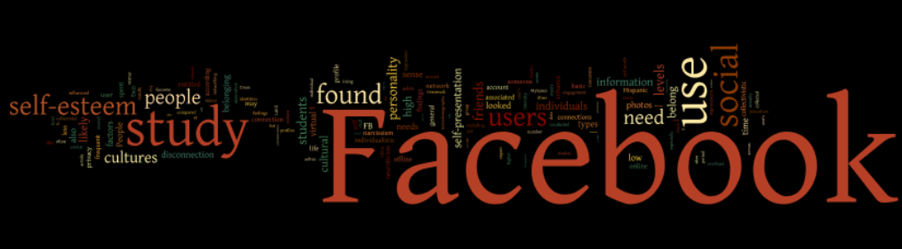
After creating a word cloud on an article called “Study: Why Do People Use Facebook?,” it was evident which words appeared most frequently within the text.  The larger the word is in the word cloud, the more times it appeared.  When looking at the word cloud, it is obvious that the largest and most prominent word is “Facebook.”  It is interesting to see that words such as social and self-esteem also pop out in the cloud.  Of course Facebook being the largest social networking site in the world, it makes sense for “social” to be an eye-catcher.  Along with “social,” “people” also stands out.  “Self-esteem” comes into play when discussing Facebook’s individualization aspect.  And with regards to individualization, “personality” and “self-presentation” are easily viewable as well.  “Culture” is a huge aspect of Facebook’s success, and sure enough the word appears in the cloud at the bottom left corner.  Check out the word cloud below:

Another reason Facebook is so popular is because of it’s user-friendliness.  The interface of the site is very simple: easy to read font, blue, white, and black neutral colors, etc.  Even the layout is easy to understand and maneuvar (although it has changed multiple times).  Most actions such as adding a friend are done with the click of a mouse.  Another neat tool Facebook has is it’s ability to be read and used in different languages, making it even more global than it already is.  Check out this PowerPoint on how to change the language of your Facebook.

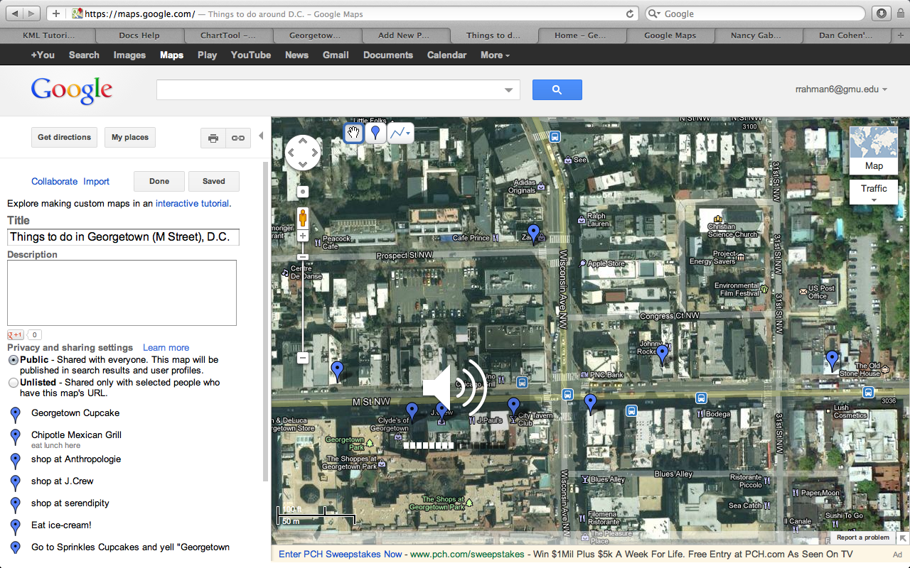
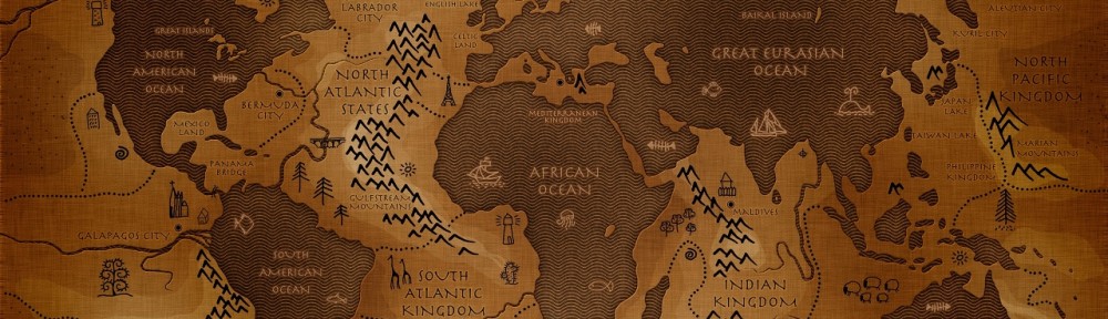
The site allows users to communicate with people all across the globe.  Families and friends from the US are able to connect with people in different locations around the world.  Facebook lets people stay in touch with others through one universal website where everyone can share as much (or little) of their lives.  This connection enables people to further create a global environment.  Ideas and innovations have begun and spread through Facebook.  People with common interests are able to connect on Facebook.  There are countless ways Facebook let’s users spread their wings.  The top ten cities currently using Facebook today are represented in the map below.

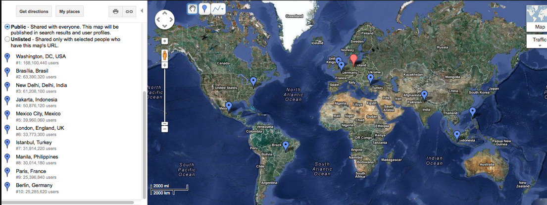
View this map in a larger and more interactive way here.

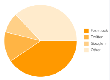
Facebook seems to always be very current and up-to-date with news and events.  This aspect of the site keeps people engaged and eager to revisit.  Events in their personal and social lives are displayed on Facebook.  Say if someone has a birthday, Facebook encourages it’s users to send a birthday wish by writing on someone’s Wall.  The office Christmas party someone is attending on a given Friday night is usually displayed on the top right hand side of their home page, reminding them of the date.  People often resort to Facebook as their news source.  Many people found out about the death of Osama Bin Laden through Facebook statuses rather than television news.  Because Facebook is the most popular social networking site, people are able to rely on it for important information.  Below is a visual representation of how much people age 30 and below depend on Facebook for their current events versus other social media sites.

It is an impressive feat to have 1/7th of the world’s population together on one mean of communication.  Facebook is by far one of the most innovative sites in modern history.  If the site continues to build as it has for the past eight years, even more history will be made.

This project is a representation of the historical growth of Facebook thus far.  To preserve this project and it’s contents, further edits may be made in the future to keep the site running, a copy of the project will be saved into a folder and also a flash drive.  The preservation of this project will allow viewers to look back on this data and compare it to future data that is yet to come.

Preserving History

Roy Rosenzweig’s essay, Scarcity or Abundance? Preserving the Past in a Digit sheds light on how history on the Internet may not always be there.  There are countless ways for information to get lost or deleted on the web.  People tend to believe that what is put on the Internet will be there forever.  Rosenzweig says, “Government archives similarly continue to rely on the unwarranted assumption that records can be appraised and accessioned many years after their creation.”  This statement shows that even the highest offices i.e. Library of Congress are carelessly archiving important information on the web.  Although they are most likely using the LOCKSS (lots of copies keeps stuff safe) principle, there is still no guarantee to documentation on the Internet.

I myself am guilty of using Facebook to archive many aspects of my life.  Sometimes I resort to storing photos on Facebook instead of storing photos in a more secure manner such as a folder or putting the content in a flash drive.  Say if Zuckerberg breaks down and deletes Facebook, what am I left with?

On the contrary, the April 16 Archive does good on the Internet by collecting and preserving memories of the Virginia Tech tragedy.  Since memories fade, this archive is able to keep the authenticity of the tragedy alive.  The stories of victims and family members provided on the site really help people carry on the slogan that came with the tragedy, “NeVer ForgeT.”

I think the best way to preserve history is to have hard copies of everything.  To many these days it seems very old fashioned but it is the only feasibly logical mean of preservation.  Pictures and family documents need to be printed and copies of everything should be put into hard drives.  It’s important to recognize that if these things aren’t done, one shouldn’t be surprised if they lose everything.

Digital Research

After reading From Babel to Knowledge: Data Mining Large Digital Collections, by Dan Cohen, the idea of creating narrow search engines rather than using broad ones such as Google search, seems brilliant.  It was interesting to see how Cohen with the help of Google’s web search API was able to build a search engine that displayed classroom course material. He called it the Syllabus Finder.  Cohen said, “I thought a search engine that could locate syllabi on any topic would be useful for professors planning their next course, for discovering the kinds of books and assignments being commonly assigned, and for understanding the state of instruction more broadly.”  Assuming that professors would prefer to have their own search engine to look for class course work rather than web searching it, I couldn’t agree more with Dr. Cohen.

There are other similar search engines like Syllabus Finder.  One of them being the TIME Magazine Corpus.  The TIME Magazine Corpus has a record of all issues of TIME from 1923 – 2006 and allows users to search for words or phrases within all the text.  Although I find the Magazine Corpus to not be very user-friendly, it can still get the job done.  Rather than searching the the entire web for certain issues of TIME, this site can come in handy.

Another notable site is the Google books Ngram viewer, that let’s you search the use of certain words in books over a certain period of time.  The site shows a line graph representation of the popularity of certain words and even let’s you compare more than one of them on the same graph.  When putting in words such as ‘flavour’ and ‘flavor’ you can really see the comparison.  The graph shows that the spelling of the word in old English (flavour) went down periodically while the current version of the word (flavor) has gone up.

I find these sites to be very useful, enabling people to search for topics within a narrower search group, rather than a broader search area such as the web.

Insight on the Feltron Reports

Aside from the small print and utter confusion with the 2010 annual report, I really enjoyed browsing through the rest of the Feltron Reports.  Check it out here.

The webpage was very simplistic and modern, both of which are qualities I admire.  The colors and font of the background and writing drew me in to feeling welcomed to the page.     I wanted to see more.  I mean, considering Nicholas Felton is a graphic designer I wouldn’t have expected anything less than a cutting edge webpage.

The content was very cool.  Other than the fact that I didn’t really care about where Felton travelled to in a given year, or how many tacos he ate, or what he took on his trip to China, I really like the idea of documenting one’s timeline in such an artistic way.  A question that came to mind is “who actually reads the Feltron Reports?”  It’s not like Nicholas Felton is a widely known iconic figure, I mean, he only has 20,576 followers on Twitter.  And also what is the purpose of the Feltron Reports?  The site has me wanting to start my own little documentation of life, perhaps call it the “Rahm Reports”?  But then again, I don’t think anyone wants to know how many tacos I ate in a given year either…

As I explored the site, I came to realize that his life wasn’t the only thing Felton was documenting.  A couple of the different types of reports I saw were his report on CNN.com and his report on budget traveling.  The one on CNN.com was actually requested by CNN for him to examine their web stats and provide them with a visual record of the site’s past 13 years.  Reading this reassured me that Felton’s work is indeed of importance.

I definitely find myself being on his webpage at times just to browse.  I found the site interesting and at times informative.  The creativity really drew my attention and I recommend others to check out his work.

My take on Hypercities

Initially, Hypercities seemed like the coolest and most innovative thing.  How awesome would it be to view the history of an exact location and see how it’s evolved over time?  As I  began to maneuvar through the site, some positive and negative aspects caught my eye.

I liked how the site had sort of an introductory page.  It helped me learn a little bit about what is in the site and how the site came about.  I was also able to get a grasp on how the site was put together.  I also liked that you don’t have to download Hypercities, unlike Google Earth, which you do have to download.  The intro page was also very welcoming.  The grey and yellow color contrast, and the layout of text and images seemed inviting to me.  Once I launched the site, I liked the bar on the top that indicated what years of maps I’d like to see.  I also like the feature to change the transparency of each map.

One of the things I didn’t like is that Hypercities, once launched was a bit slow.  And sometime very slow.  As I changed from one map to another in Los Angeles, the maps wouldn’t change as quickly as I’d like them to or not at all.  Some maps that I clicked on didn’t show up at all.  I also didn’t like how only 27 cities could be explored.  Understanding that the site is still in it’s Beta form, it still has a lot of improvements that need to be made.

All in all, the site was fun to explore.  It gave me a good idea about what it looks like to overlap one map on another.  I’m pretty thrilled to try it on my own.

Exploring Google Chart Editor and Google Maps!

Here is my attempt at creating a chart on Google chart editor.  I found it to be a bit troublesome.  It was somewhat difficult to maneuver through the tabs and figure out which aspect of the graph is under which tab.  The chart editor is still in it’s beta form, and it is very apparent when using the site.  All in all, there are obvious improvements that need to be made to Google chart editor but I’m not crying about it.

Here is my attempt at making a map on Google maps.  It was pretty easy to search a location and drop a pin on it.  I like that you can add descriptions to each pin.  I’m not entirely sure as to what the lines are for.. First I drew a huge line connecting all my points of interest, then deleted it after realizing it was stupid.  Bottom line is that I like Google maps.  I might actually create a map or two in my free time, especially if I’m trying to create an agenda of things to do when I’m on vacation.


Oops.. I’m unprotected

Reading “Passwords Under Assault” by Dan Goodin was a little frightening.  It turns out that many people are facing problems on their private sites due to hacking.  Hacking has become a huge threat to users on the Internet, leaving most of us vulnerable to it’s risks.

A point that was brought up many times in the article was that so many people reuse certain passwords for more that one site at a time.  Goodin mentioned that the average Web user maintains 25 separate accounts but uses just 6.5 passwords to protect them, according to a landmark study (PDF) from 2007.  Those numbers seem about right to me, considering I am also guilty of being one of these people.  The password I use for Facebook, I also use on Twitter, my back account, email, and various other sites.  After reading the article and as I write this post, I think to myself that I might as well go ahead and display my password on here because it seems as if it wouldn’t be very difficult for a hacker or you to obtain it yourselves.

According to the article, some of the methods of creating passwords I once thought were safe are not so safe after all.  I had heard that writing out a word and then writing the same word backwards (pantsstnap) was a good way to throw the hackers off, but it turns out that most of the time their creepy ideologies can see past tricks like that.

I’ve learned that creating sentences is a smart way to go about making a strong password.   Sentences are difficult for hackers to decode because it could be a variation of many different words.  If there is a character limit on the password, the first letter of the first word in the sentence can make up the password.  Another useful trick is the use of punctuation. Punctuation makes a code extremely strong.  Adding a “!” to a word or sentence makes it more difficult to crack.

Now that I know the difference between weak and strong passwords, I definitely have to reevaluate my password construction.  I’ll surely be changing a lot of passwords in the near future.

Ethics behind news archive site

The TV News Archive was extremely fascinating to me.  I think that to be able to have years of news broadcasts at one’s fingertips is simply brilliant.  I personally love watching the news whether it is current or not.  The way news is broadcasted really draws me in to the content for some reason so for a person like me, this website is pure excitement.

If the moon falls out of the sky (hypothetically) and news reporters are broadcasting it live on NBC, to think that people 100 years from then would be able to watch the live footage as it was happening is simply amazing.  I think the TV News Archive website is a great way of preserving history.

Even though the team behind TV News didn’t consult every news station before displaying their content on the site, they shouldn’t run into any legal problems.  TV News Archive is a nonprofit organization simply providing an archive of information that would have otherwise been inaccessible.  On top of it being nonprofit, the organization is also for educational purposes, making it the least bit of a threat.  Also, the videos on the site are not 100% current.  The newest videos are at least 24 hours old, therefore it isn’t interfering with whether or not people watch the news on television… considering that most like their news to be very up-to-date.

News is an important aspect of everyday lives of individuals and to be able to preserve the content in video form is a great accomplishment.  Now that I’ve been introduced to this site, I definitely imagine myself referring back to it in the future.

** Plus, if I was on live tv news one day and wanted to see it for myself when I got home, I could simply tune into this site and search for my clip!